Released DotVVM 4.1
Published: 2/6/2023 4:56:30 PMAfter 8 months, we are thrilled to announce the release of DotVVM 4.1. The release contains the new DotVVM Auto UI library, numerous improvements and bug fixes, and a bunch of improvements of Composite controls which allowed us to create a brand new implementation of Bootstrap for DotVVM for Bootstrap 5.
DotVVM Auto UI
The idea of auto-generating forms and grids based on model classes and data annotation attributes is not anything new. Previously, we had a package called DotVVM Dynamic Data, which could do this.
The problem of Dynamic Data implementation was mainly the performance. On every HTTP request, Dynamic Data components were doing a lot of Reflection calls including compilation of data-bindings. Some things were cached, but a lot of things couldn’t be done properly.
With DotVVM 4.1, we are now publishing a new package DotVVM.AutoUI.
To use the library, you need to register it in the ConfigureServices method in DotvvmStartup.cs:
options.AddAutoUI();After that, you can use the Auto UI controls in your DotVVM pages. Currently, there are several controls:
- <auto:Editor Property=… /> will auto-generate editing control for a property you’ll bind to it. If it is a string, it will be a TextBox. For booleans, it will be CheckBox, and so on.
- <auto:Form /> comes in two versions – the most popular will be <auto:BootstrapForm />. It will look at the DataContext property of itself or of its closest ancestor, and generate a complete form for all properties defined in the data context object. The field labels and other metadata will be provided using Data annotation attributes.
- <auto:GridViewColumns /> is a special type of column which can be used in the GridView control. It will generate columns for all properties of the objects bound to the DataSource.
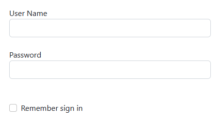
If you want to generate a simple login form, you will need to decorate your model class with a few attributes:
public class SignInModel
{
    [Display(Name = "User Name")]
    [Required(ErrorMessage = "User name is required!")]
    public string UserName { get; set; } = "";

    [Display(Name = "Password")]
    [Required(ErrorMessage = "Password is required!")]
    [DataType(DataType.Password)]
    public string Password { get; set; } = "";

    [Display(Name = "Remember sign in")]
    public bool RememberMe { get; set; }
}
The BootstrapForm control will do the rest, including the validation:

Since it can be boring to decorate every field with the Display attribute, Auto UI supports also providing the field labels using a RESX file. The keys are the property names and the values are the localized texts for each culture.
If you have been using Dynamic Data, the migration should be quite easy – just the control names are different, but their usage is similar. Auto UI has also several new features which weren’t present in Dynamic Data.
Selections
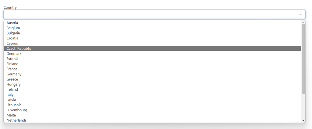
Often, you need the user to select some value from a list. Auto UI brings the Selection attribute which defines the type representing the set from the user is selecting.
// add the Selection attribute on the property
[Selection(typeof(CountrySelection))]
public int? CountryId { get; set; }
You need to implement an ISelectionProvider<YourType> to provide values for the selection.
public record CountrySelection : Selection<int>;

public class CountrySelectionProvider : ISelectionProvider<CountrySelection>
{
    private readonly AppDbContext dbContext;

    public CountrySelectionProvider(AppDbContext dbContext)
    {
        this.dbContext = dbContext;
    }

    public Task<List<CountrySelection>> GetSelectorItems()
    {
        return dbContext.Countries
            .OrderBy(c => c.Name)
            .Select(c => new CountrySelection()
            {
                Value = c.Id,
                DisplayName = c.Name
            })
            .ToListAsync();
    }
}
Finally, include the property of type SelectionViewModel<YourType> in the page viewmodel and initialize it. The rest will happen automatically.
// add this to the page viewmodel
public SelectionViewModel<CountrySelection> Countries { get; set; } = new();
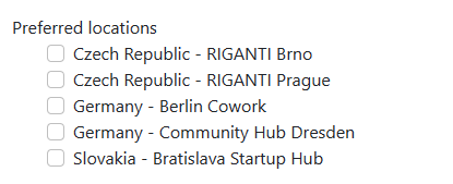
Note that this will also work for collections – if you want to allow the user to select multiple items, use List<int> in your model class. Auto UI will generate a list of checkboxes.

Customization of field editors
Another feature which wasn’t really possible in previous Dynamic Data implementation, was to cover exceptions with custom field templates, and respond to changes to the auto-generated fields. Often, you can generate the entire form except for one property with some special behavior.
This can be covered by property groups of the <auto:Editor> and <auto:GridViewColumns>:
<auto:BootstrapForm DataContext="{value: Meetup}"
                    Changed-CountryId="{command: _root.OnCountryChanged()}">
    <EditorTemplate-ImageUrl>
        <img src="{value: ImageUrl}" Visible="{value: ImageUrl != null}" class="img-thumbnail" />
        <dot:FileUpload UploadedFiles="{value: _root.ImageUpload}"
                        UploadCompleted="{command: _root.ProcessImage()}" />
    </EditorTemplate-ImageUrl>
</auto:BootstrapForm>
The Changed-PropertyName property allows to hook on the Changed (or equivalent) event of auto-generated controls. The EditorTemplate-PropertyName allows to provide a custom editor – in our example we are giving the user a FileUpload control to upload the profile image, instead of generating just a TextBox (because ImageUrl is a string property).
Configuration fluent API
The last but not least feature of DotVVM Auto UI is the option to use conventions instead of placing data annotation attributes to every property in every model class.
options.AddAutoUI(options =>
{
    options.PropertyMetadataRules
        .For(property => property.Name.EndsWith("Price"), rule => rule.SetFormatString("n2"));
});
This will use the two decimal places number format for all properties with name ending with the word “Price”. If your model follows good naming conventions, you can do a lot of magic with this.
You can find more info in the the new Auto UI chapter in DotVVM documentation.
Markup declared properties
If you ever wrote your own markup control and wanted to add properties to is, you probably know that it requires creating a C# class and invoking the crazy dotprop code snippet.
Starting with DotVVM 4.1, you can now declare the properties using the @property directive at the top of the file. You can include a default value, and also specify the attributes of the property.
@property string Title = "Panel"
@property List<CategoryModel> Categories, MarkupOptionsAttribute.AllowHardCodedValue = false
See all options of markup declared properties here.
Stable version of React components in DotVVM
DotVVM 4.0 introduced an experimental support of hosting React components in DotVVM pages. In DotVVM 4.1 we’ve fixed many issues and marked this feature as stable.
You can now use React components in your DotVVM pages, bind the viewmodel data into their properties, and respond to the events which happen in the control.
<js:Recharts data={value: Data}
             onMouse={staticCommand: (string n) => CurrentThing = n}>
</js:Rrecharts>
The control is exported from a JS module which you import in the page using the @js directive.
import * as React from 'react';
import * as ReactDOM from 'react-dom';
import { registerReactControl } from 'dotvvm-jscomponent-react';
import { LineChart, XAxis, Tooltip, CartesianGrid, Line } from 'recharts';

// react component
function RechartComponent(props: any) {
    return (
        <LineChart
            width={400}
            height={400}
            data={props.data}
            margin={{ top: 5, right: 20, left: 10, bottom: 5 }} >
            <XAxis dataKey="name" />
            <Tooltip />
            <CartesianGrid stroke="#f5f5f5" />
            {
                Object.keys(props.data[0]).slice(1).map((s, i) =>
                    <Line type="monotone"
                          dataKey={s}
                          stroke={"#" + (i * 4).toString() + "87908"}
                          yAxisId={i}
                          onMouseEnter={(_) => props.onMouse(s)} />)
            }
        </LineChart>
    );
}

export default (context: any) => ({
    $controls: {
        Recharts: registerReactControl(RechartComponent, {
            context,
            onMouse() { /* default empty method */ }
        })
    }
})
The RechartComponent function builds the LineChart component from the popular Recharts React library. It will pass the props.data collection as the chart data, and call the props.onMouse function whenever the user hovers on some series in the chart.
The module exports a factory for the JS module instance, and this instance contains the $controls object. The Recharts key in this object will be published as <js:Recharts> component in the DotVVM page. You just need to wrap the RechartComponent function with the registerReactControl – this is the integration bridge between DotVVM and React.
We have a similar mechanism for Svelte in progress, and it is not difficult to support other JS frameworks in the future.
Bootstrap for DotVVM support of Bootstrap 5
Our Bootstrap for DotVVM commercial packages supported Bootstrap 3 and 4, and we are finally adding the support for Bootstrap 5. The reason why it took us so long was that we wanted to implement the controls using the new Composite controls approach introduced in DotVVM 4.0. During the implementation we found a lot of things to be improved, and it required delaying the release until now.
Supporting the next version of Bootstrap will be much easier – the composite controls are much cleaner and much better maintainable than the classic approach of writing controls. Also, we heavily utilized the Control capabilities because some Bootstrap components contain very similar properties, or have different versions for various purposes (e. g. CheckBox used in the InputGroup renders a bit different output and some of its properties don’t make much sense). Instead of using inheritance which has many limits, we can build the controls by using multiple capabilities which work similarly as mixins.
If you have purchased a license for Bootstrap for DotVVM in the last 12 months, you should be able to see the new package DotVVM.Controls.Bootstrap5 on the DotVVM NuGet Feed immediately. If you purchased the license earlier, you will need to renew it to get the new release (and you’ll get 12 months of new versions, improvements and bug fixes as a part of the license).
Since this is a brand new library, we expect issues. If you find any glitch or unwanted behavior, please let us know – we’ll publish a fix immediately. And check for the new versions – we expect several revision releases to be published within the next weeks.
DotVVM Business Pack
There were several infrastructure improvements in DotVVM Business Pack as well.
The most visible change is that we’ve split the CSS and JS bundle into smaller modules. Thanks to that, the pages using the Business Pack controls will load faster and download less resources.
Here is a comparison for a page using GridView, Button, DataPager and a TextBox:

For the next release, we plan several major improvements we have already started working on:
- GridView cell edit mode – when enabled, it will allow the users to change values in the individual cells (like in Excel) and give you events to respond to these edits.
- Grouping in GridView – we have struggled to find a good way of how to approach grouping so it doesn’t collide with paging and other features. Now we think we found it, and it will be available soon.
- Responsive styles and behavior for ComboBox, DropDownList, MultiSelect and Date/Time/ColorPicker controls – currently they have some issues on mobile and touch screens.
Summary
I’d like to personally thank the team and all contributors from the community. Thanks to your feedback, bug reports and code contributions, we were able to release this large bag of features. The full list of changes in in the Release notes.
We’d be happy to hear your feedback. Join the discussion on our Gitter chat!

I am the CEO of RIGANTI, a small software development company located in Prague, Czech Republic.
I am Microsoft Most Valuable Professional and the founder of DotVVM project.
